When designing a website, the design is often influenced by photos and images.
Having good images on your website is very important as the quality of your images reflect on the quality of your brand.
However, not all images have to be professional photos and with a modern phone, you can take great photos that can be used all over your website.
I want to apologise in advance as most of the example images will be of my shed, just warning you in advance 🙂
Why should you take your own photos and not use some of the billions available online?
Three reasons –
- Good quality images available online cost money. That is only fair as the creator has spent time learning their trade and uploading their images for others to use, but if you can use your own, you can save a bit of money. BUT, don’t just copy others images as you will get caught and you might even get fined (there is software that scans for copied images on the internet).
- There are only so many quality images for your niche, product or service and your competitors have probably already used the good ones. By using your own you stop looking like everyone else and give your website more authenticity.
- Your customers want to see your work. Taking good photos of what you do builds on the trust a potential customer will have with you. This is especially important for galleries of your previous work.
But, just because having your own images is better than using those created by others, they still need to be good images. I am not saying they need be professional quality but by following a few simple tips below, you can create photos that get very close to the pros.
Before we start, this information is specifically about taking pictures for use on your website. Some advice may be the opposite of what you know for taking good holiday or family pictures, but remember, they are very different subjects for different outcomes.
Don’t Accept Blurry Photos.


When using a mobile to take pictures, camera shake is a constant battle but it can be overcome.
Make sure you have a good grip on your phone/camera. Do not be tempted to hold it in your fingertips at arm’s length, that makes the camera unsteady and is the main cause of blurry photos.
hold your phone using your whole hand (not fingertips) then use the volume button to take the photo (do not tap the screen button). If possible hold the phone close to your body and/or brace yourself against something solid such as a table, doorframe or vehicle.
Leave Space Around the Subject
When taking pictures for a website remember to leave some space around the subject of your picture to allow the designer to crop (cut) out parts of the picture or change the size or shape of the picture.


Examples of the different image dimensions for 6 popular Social platforms.
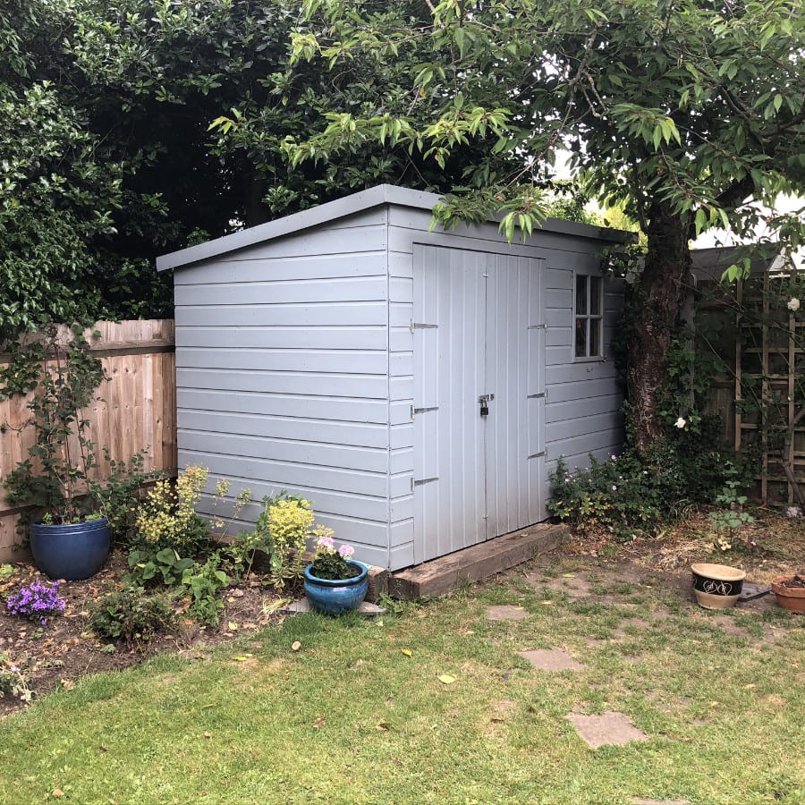

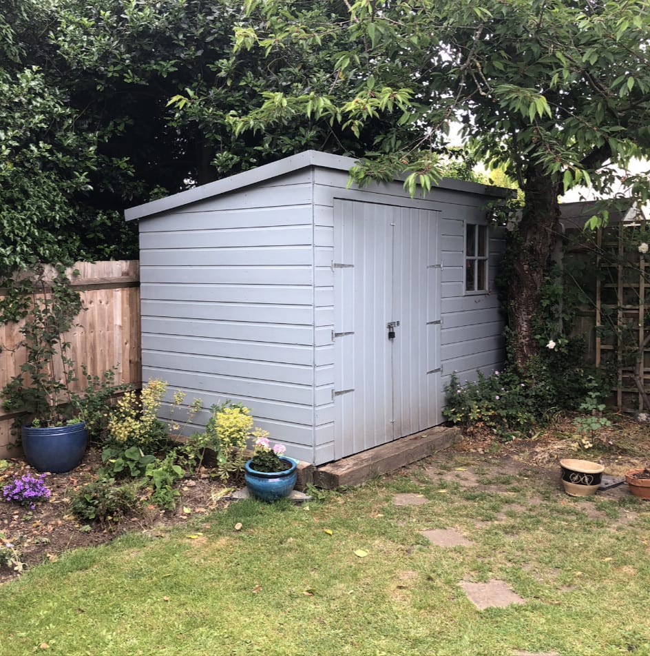


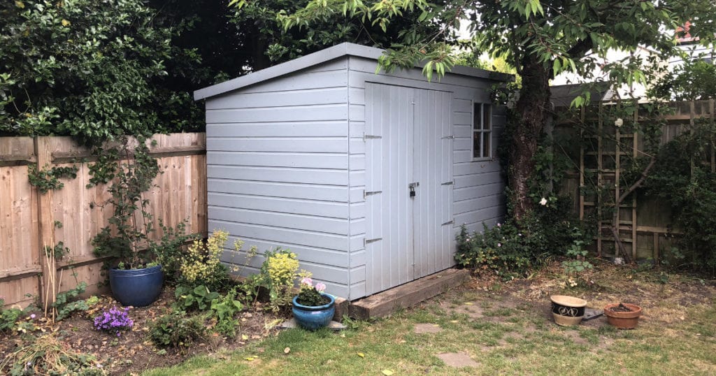
The photos in your phone are saved as large images so there is no need to get in too close and as you can see from the examples above, if I only had the “close-up” image of the shed and tried to share that image, I would loose some of the shed 🙁
Take Photos In Landscape Mode
In general, always take pictures in “landscape”, i.e. hold your phone on its side so the picture is wider than it is high.
We are used to seeing images in landscape mode as that was how most cameras took the photo. This is changing over time with the use of mobile phone cameras but, as you can see from the example image above, most social platforms want images in landscape or square dimensions (with the exception of Instagram which is only available on phones so adopts the “portrait” image layout).


Sometimes, you can use “portrait” (holding your phone upright), but only really where the subject you want to capture is taller than it is wide (some vertical pipes, a tall building etc).
Take Lots Of Photos
On your mobile, there is no difference in cost between taking 2 or 20 photos.

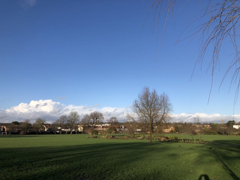


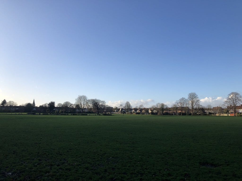
Take as many as you can, duplicating the shot and then take some from different angles or positions. It is always better to have too many than not enough as you can simply delete the ones you don’t like or are blurry etc.
Use Manual Focus/White Balance If Needed.
Your phone camera can do amazing things nowadays but sometimes it needs your help.
When looking at your screen before taking a photo, you can tap the image on the screen to force the camera to focus on that part of the picture.
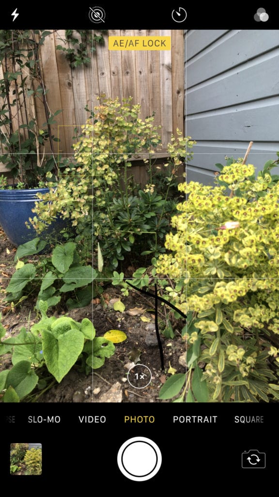

This can help if you have very dark or light parts of the scene so taping on one of them will force the camera to use that part of the picture to calculate its focus and white balance.
Think About Your Background
When Outside
Be aware of what is around, and especially behind, the target of your photo.
In the example here, the subject, an eagle is in the centre of the photo but the background is so busy, it takes the focus away from the eagle.

In fact, I bet the first thing you noticed was the yellow boat!
If taking a picture of a person, have them stand in front of a plain coloured surface first and then repeat with an interesting background (bushes work well), but don’t make the background more interesting than the target.
The plain background will allow the designer to remove the background if it helps the website design. Having a similar image with an interesting background gives the designer another option.
If taking a picture of a vehicle, make sure it is not parked in front of a busy scene, try to find a quiet place with plain backgrounds or somewhere it might be seen (a residential street).
Also, try to avoid pictures with unknown individuals in, i.e. high street scenes, Schools etc.
When Inside
When taking pictures of your work, make sure the surrounding area is as clear as possible (move ironing boards and clothes from cylinder cupboards etc.).
Be careful not to include any personal or identifying items in the photo.
Remember, the focus should be on what you want, your work, so keep that in mind.
Light Matters
When Outside
Strong sunlight should be avoided as it creates sharp highlights and dark shadows, so difficult to balance.
Sunlight also makes people squint and frown and reflections cause problems with windows and shiny surfaces.
Overcast days are better as the clouds diffuse the sunlight and even-out the highs and lows, no need to squint or frown and fewer reflections.
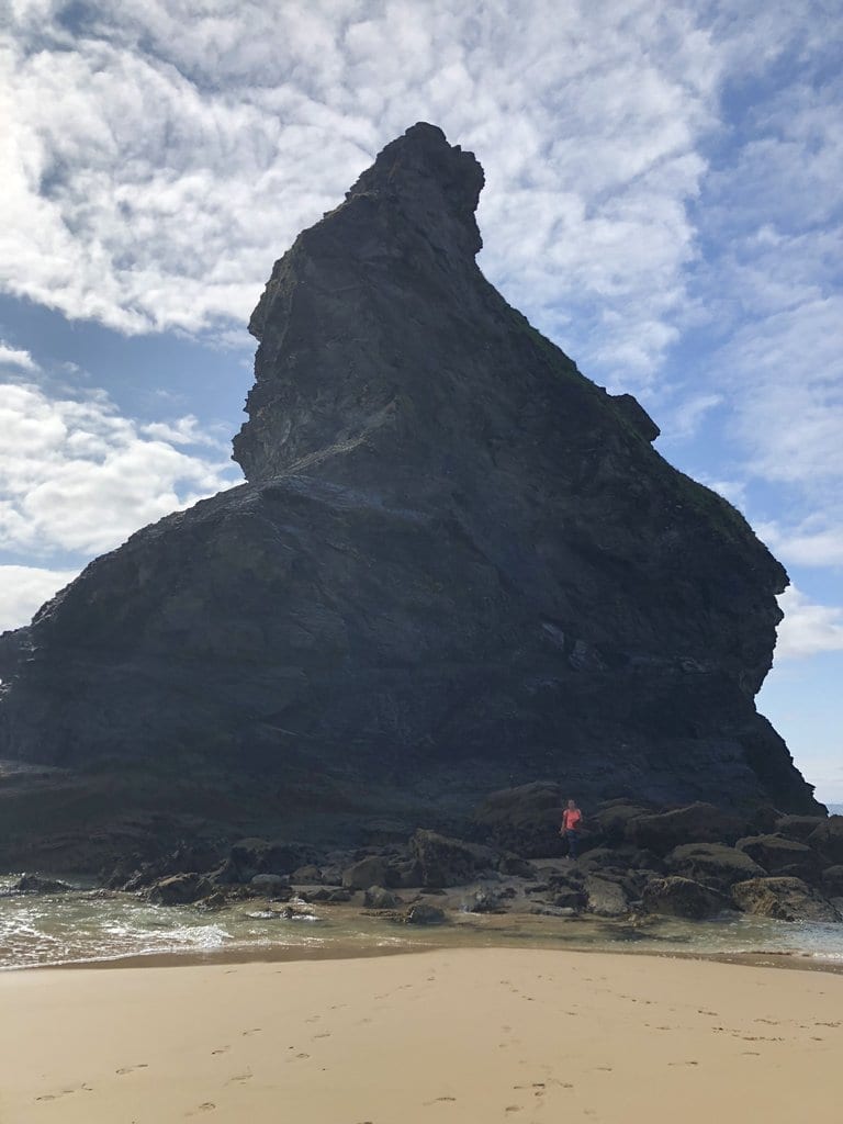
And don’t forget the Manual Focus / White Balance trick to turn an overexposed image on a bright day, to a useable photo:

When Inside
Try to have more than one light source.
A window and internal lights are a good option as this mixes the colour of the light and reduces harsh shadows.
Try not to rearrange the customers rooms just for your photo.
Do the best with what you have but don’t get too worried about the outcome, as there will always be another opportunity.
Check Your Composition
If taking pictures of people – Focus on the eyes.
Don’t get too close (phone cameras have a slight fisheye effect which makes noses bigger!).
The resolution of modern phone cameras are high so there is no need to fill the picture with the face. Step back and take a picture of the whole upper body (waist up) leaving some space above the head. The designer can then crop (cut out) what they need.
If taking pictures of your work or anything else, try different positions and angles, left, right, high and even low (get on your knees), just remember to leave some space around the subject and keep the camera level and steady.
Your Photos Have Seconds To Make A First Impression.
Using your own photos builds trust and gives the visitor some insight into you and your attitudes.
First impressions mater so don’t waste it on dirty, untidy or fake subjects. Make sure that whatever you photograph is clean and tidy.
If it is a person, make sure they smile, don’t force it or fake it, take a number of photos and have the person taking the photos engage the subject in conversation and have fun. Then whilst doing this, take lots of photos.
This may sound odd but it will give you better, more natural photos and the “having fun” will show in the final pictures.
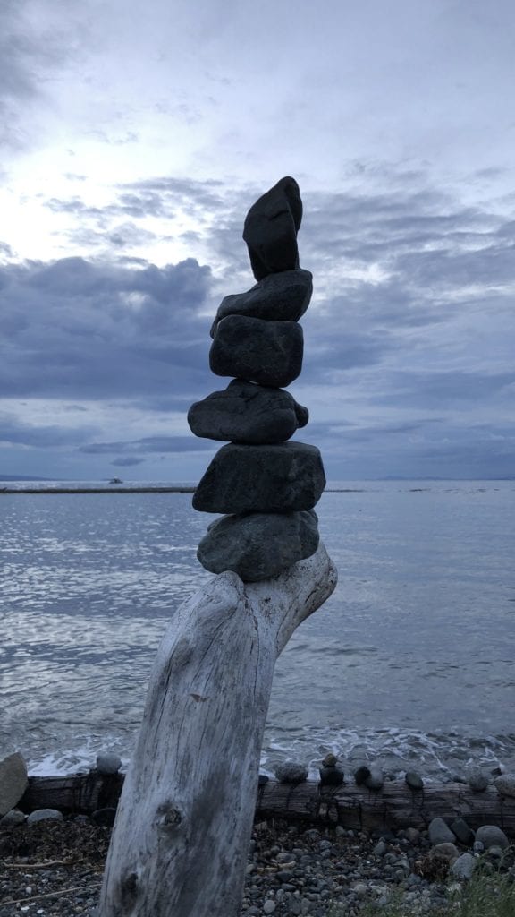

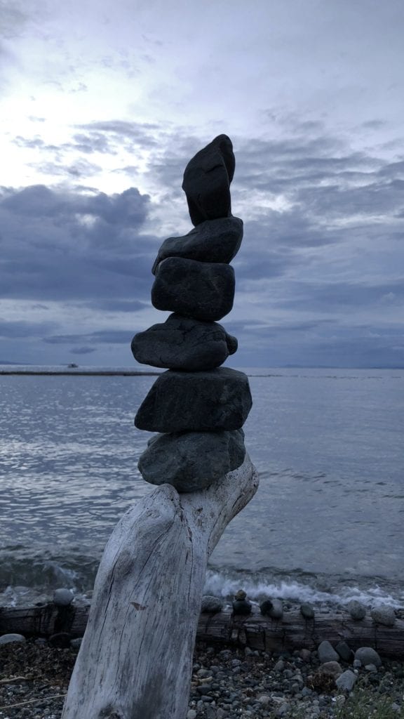
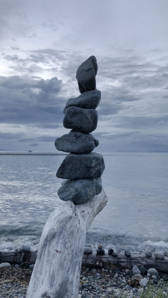
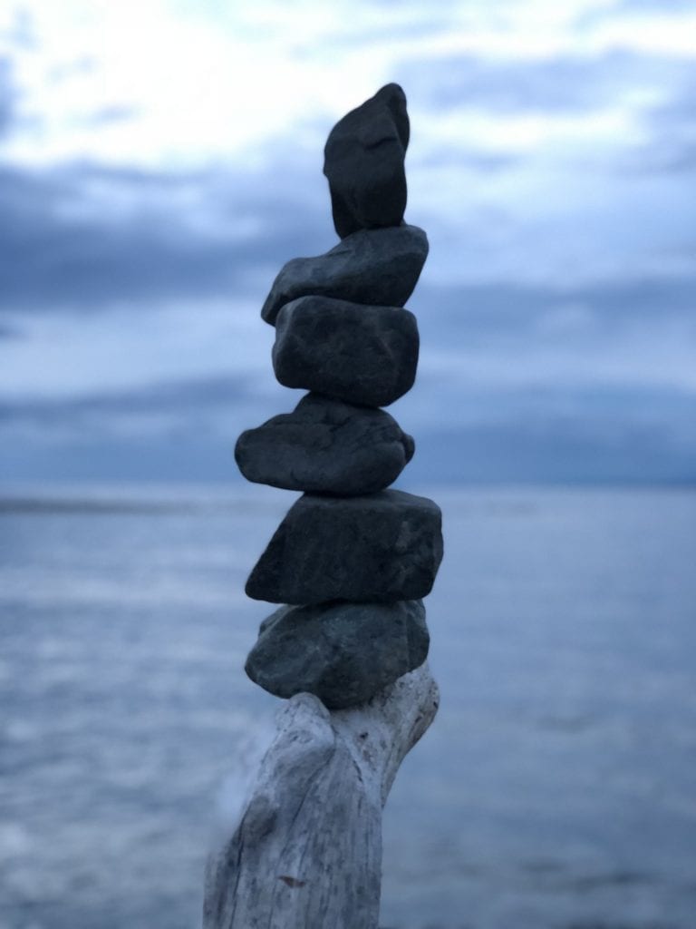
Don’t stress or worry about it, just give it a go, take a load of photos (yes, I keep repeating this for a reason) and select the best ones.
Lastly, Don’t “Send” The Photos To Your Website Designer.
The most common way of sending photos to a designer is by email, closely followed by WhatsApp and text message (iMessage).
Don’t do it! When shared this way, the images are often reduced in size meaning what was a great photo with lots of scope for the designer to work with becomes a small, fuzzy image that cannot be used.
Your website designer should create a shared drive using Google Drive, OneDrive, Dropbox or similar. They can then share a part of that space with you and you can upload the photos to that shared space.
All good cloud based storage companies have mobile apps allowing you to save them straight from your phone.
This means the image your designer gets is as large as possible and gives them the option to trim, cut and crop the photo to work best with their design.
Cover Photo by Ethan Hoover on Unsplash – Other photos, my own examples

